
JournalTopics
Topic
Palette
Color in art: pigments, mixing, harmony and symbolism, and the history of how each color was made.
May 2026
February 2026

Why Titanium White Behaves Differently Than Lead White
The chemistry behind titanium white vs lead white in oil painting. Why particle size, opacity mechanisms, and drying chemistry create fundamentally different paint behavior.
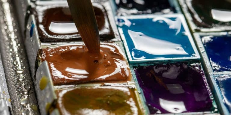
Why Gouache Reactivates With Water While Acrylic Doesn't
The chemistry behind gouache's water solubility versus acrylic's permanent film. Why gum arabic stays reactivatable while acrylic polymers lock permanently.
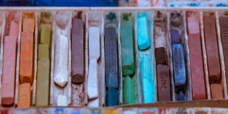
Why Some Pastels Smudge More Than Others
Why some pastels smudge more than others through pigment-to-binder ratios, particle hardness, and paper tooth interaction. The materials science behind pastel adhesion.
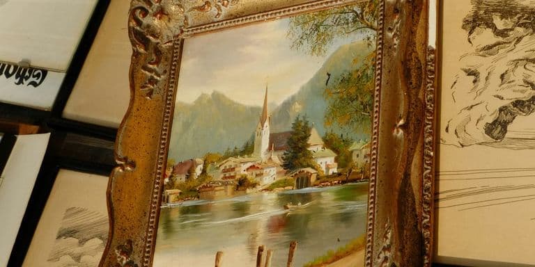
Why Your Paintings Look Muddy and How to Fix Color Mixing Problems
Why paintings look muddy and how to fix color mixing problems. The science of chromatic neutralization, pigment transparency, and value control in mixing.
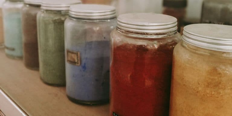
Natural Pigments and the Geology of Color Through History
How geological processes created the pigments that colored art history. From lapis lazuli mines in Afghanistan to ochre deposits shaping cave paintings.
Advertisement
More from the journal
- Why Your Paintings Look Muddy and How to Fix Color Mixing ProblemsWhy paintings look muddy and how to fix color mixing problems. The science of chromatic neutralization, pigment transparency, and value control in mixing.
- How Pointillism Exploits Optical Mixing vs Pigment MixingThe science behind pointillism's optical color mixing. Why Seurat's dots work at distance but fail up close, and what retinal mixing actually achieves versus theory.
- Why Titanium White Behaves Differently Than Lead WhiteThe chemistry behind titanium white vs lead white in oil painting. Why particle size, opacity mechanisms, and drying chemistry create fundamentally different paint behavior.
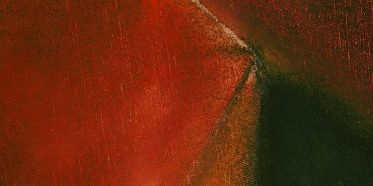
The Rothko Effect and How Large Color Fields Create Emotional Response
Why Rothko's paintings make people cry and how large color fields trigger emotional response. The phenomenology, neuroscience, and technique behind the effect.
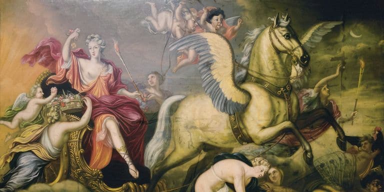
How Color Symbolism in Religious Painting Changed Across Centuries
Religious painting color symbolism changed dramatically across centuries. Blue shifted from modest to divine, gold lost dominance, and meaning evolved with theology.

Why Red Means Different Things in Western and Chinese Painting
Red means aggression in Western painting but celebration in Chinese art. How cultural context changes color symbolism and what artists need to understand.
December 2025
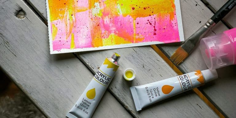
How Synthetic Pigments Destroyed (and Democratized) the Color Economy
The 19th-century synthesis of artificial pigments collapsed prices by 90-99% and eliminated scarcity that had shaped painting for millennia. How cheap color enabled new art movements, destroyed traditional dye industries, and changed what pigments could mean beyond their visual properties.
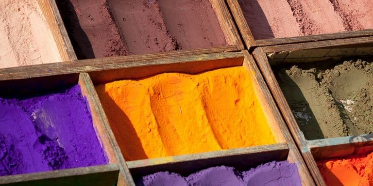
The Truth About Pigment Prices: What Artists Actually Paid Throughout History
Renaissance contracts reveal ultramarine cost more than gold per weight. Historical account books, guild records, and artist negotiations show how material economics shaped what got painted and where expensive colors could appear.
The Most Expensive Colors in History (and Why They Cost a Fortune)
Discover why Tyrian purple cost more than gold, ultramarine bankrupted painters, and arsenic greens killed their users. The brutal economics behind history's most expensive colors reveal how rarity, empire, and desire shaped what artists could create.
Advertisement
More from the journal
- Why Your Paintings Look Muddy and How to Fix Color Mixing ProblemsWhy paintings look muddy and how to fix color mixing problems. The science of chromatic neutralization, pigment transparency, and value control in mixing.
- How Pointillism Exploits Optical Mixing vs Pigment MixingThe science behind pointillism's optical color mixing. Why Seurat's dots work at distance but fail up close, and what retinal mixing actually achieves versus theory.
- Why Titanium White Behaves Differently Than Lead WhiteThe chemistry behind titanium white vs lead white in oil painting. Why particle size, opacity mechanisms, and drying chemistry create fundamentally different paint behavior.
November 2025
Color Constancy and Context: Why the Same Pigment Looks Different
The same pigment appears dramatically different depending on surroundings and lighting. Understanding color constancy transforms frustration into technique.
The Invention of Mauve: How One Synthetic Dye Changed Art Forever
An 18-year-old's failed chemistry experiment in 1856 accidentally created the first synthetic dye. Mauve didn't just add a color; it revolutionized art materials forever.
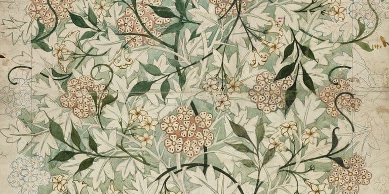
The Triadic Power of Purple, Orange, and Green in Art Nouveau
Art Nouveau's signature palette wasn't accidental. This triadic harmony of purple, orange, and green embodied the movement's philosophy while solving technical problems.
You're Not Seeing Color the Same Way as Everyone Else
Color exists in your brain more than in the world. The science of color perception explains optical illusions, simultaneous contrast, and why context changes everything about how we see color.
Working With Fewer Colors Makes Your Art Stronger
Limited palettes force creativity and create cohesion in ways full palettes never do. Working with three to five colors teaches you more about color mixing and harmony than using everything.
October 2025
Color Harmony Isn't About Following Rules You Learned in School
Complementary, analogous, triadic schemes feel limiting until you understand why they work. Color harmony systems give you frameworks for creating palettes that actually feel cohesive and intentional, but the formulas are starting points for exploration rather than rules to follow blindly.
Advertisement
More from the journal
- Why Your Paintings Look Muddy and How to Fix Color Mixing ProblemsWhy paintings look muddy and how to fix color mixing problems. The science of chromatic neutralization, pigment transparency, and value control in mixing.
- How Pointillism Exploits Optical Mixing vs Pigment MixingThe science behind pointillism's optical color mixing. Why Seurat's dots work at distance but fail up close, and what retinal mixing actually achieves versus theory.
- Why Titanium White Behaves Differently Than Lead WhiteThe chemistry behind titanium white vs lead white in oil painting. Why particle size, opacity mechanisms, and drying chemistry create fundamentally different paint behavior.

Why Warm and Cool Colors Change Everything in Your Art
Meta Description: Color temperature affects mood, depth, and visual impact more than you think. Understanding warm and cool colors transforms how you see, mix, and use every hue in your work, but temperature is relative rather than absolute and exists within every color.
Purple Was the Most Expensive Color for Thousands of Years
Purple was so rare and expensive for thousands of years that only royalty could afford it. A single gram of Tyrian purple required thousands of sea snails, making it worth more than gold and creating associations with power and spirituality that persist today.
Green Represents Both Life and Decay Depending on Context
Green is everywhere in nature but notoriously hard to get right in art. Understanding green means grasping how it shifts with light, how culture loads it with meaning from life to decay to money, and why it needs careful handling in every context.
Orange Gets Ignored and That's a Mistake in Your Palette
Orange sits between red's aggression and yellow's cheerfulness, often overlooked for being too loud or too autumn. But orange offers warmth and energy that neither parent color can match on its own.
Yellow Is the Most Difficult Color and Most Artists Get It Wrong
Yellow is tricky because it loses its identity faster than any other color. Too much white and it disappears, too much of anything else and it turns green or orange or brown before you realize what happened.
Red Demands Attention and That's Exactly Why It's Dangerous
Red is the most psychologically powerful color, triggering immediate physical and emotional responses. Understanding red means knowing when to use its intensity and when it overwhelms everything else in your composition.
Advertisement
More from the journal
- Why Your Paintings Look Muddy and How to Fix Color Mixing ProblemsWhy paintings look muddy and how to fix color mixing problems. The science of chromatic neutralization, pigment transparency, and value control in mixing.
- How Pointillism Exploits Optical Mixing vs Pigment MixingThe science behind pointillism's optical color mixing. Why Seurat's dots work at distance but fail up close, and what retinal mixing actually achieves versus theory.
- Why Titanium White Behaves Differently Than Lead WhiteThe chemistry behind titanium white vs lead white in oil painting. Why particle size, opacity mechanisms, and drying chemistry create fundamentally different paint behavior.
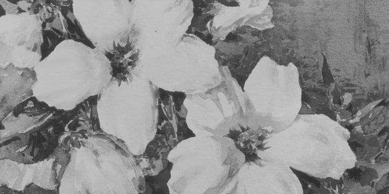
Black and White in the Age of Color
Artists choose monochrome despite unlimited color access. What black and white offer: graphic clarity, historical weight, restraint—that color cannot provide.
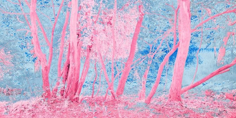
The Return of Pink: From Dismissal to Reclamation
Pink once seemed too feminine for serious art. Contemporary artists now reclaim it—not naively, but with full awareness of its fraught gendered history.
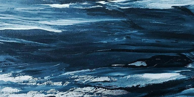
The Psychology of Blue in Contemporary Art
Blue dominates contemporary art for reasons beyond aesthetics. How artists use blue to manipulate emotion, suggest depth, and challenge color expectations.